UI tour
The CommandRunner widget is a single dock panel divided into a top bar, a left sidebar, and a right command panel. Here's every element, what it does, and where to find it.
Top bar
Three regions, left to right.
Sidebar toggle (hamburger / chevron)
Collapses or expands the sidebar. The icon morphs from three horizontal lines (hamburger) to a right-pointing chevron when collapsed. State is persisted across plugin reloads via plugin:SetSetting("SidebarCollapsed", ...).
Header group (active command)
Shows the name of the currently-selected command. When nothing's selected, reads "No Command Selected" in dimmed text.
Action buttons
Three entries, left to right:
- Settings (gear): opens the Settings popup. Toggles for live regen, hover tooltips, sidebar tag chips, follow-active-script, auto-open-on-add, plus the editable default command template. See settings.
- Library (book): opens the cross-place library popup. See cross-place library.
- Edit pencil: opens the active command's source in the script editor. While the editor is the active tab, the same button toggles to a save icon that runs the regenerate-types flow before saving.
The layout uses a horizontal UIListLayout so adding more buttons doesn't disrupt the existing positions.
Sidebar

Search bar
Filters the command list as you type. Tokenized:
- Bare tokens (e.g.
recolor) AND-match command names (substring, case-insensitive). #tagtokens AND-match the effective tag set (declared + extras).#@clientworks. The leading@is stripped before comparison.
The search is cleared every time the widget is hidden, so re-opening starts fresh.
Command list
Each entry is a TextButton showing:
- The command name (truncated with ellipsis if too long).
- A horizontal TagStrip below the name with chips for each effective tag. Reserved tags (
@server,@client) get distinctly-colored chip text, green-ish for@server, Studio blue for@client.
Right-clicking a command opens the per-command context menu. Right-clicking inside the args panel (when an argument card is under the cursor) opens a similar menu with extra arg-specific items.
Add button
The + at the bottom of the sidebar. Click it to open the rename modal, type a name, confirm, and a new ModuleScript is created from the default template. Sibling Types is created automatically.
Right-click context menu
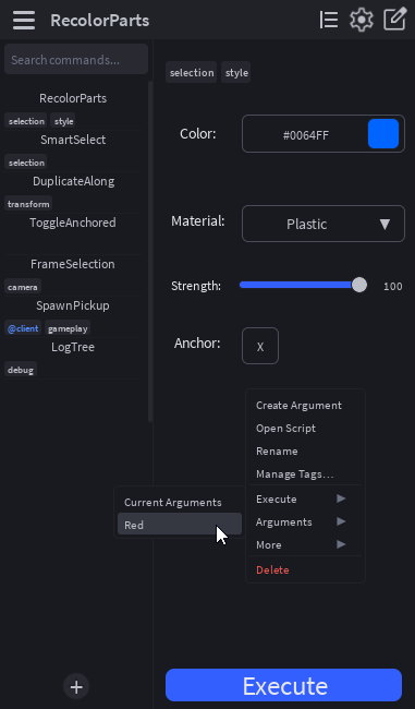
Top-level items, in order:
| Item | Action |
|---|---|
| Clear Output | (Prepended only when right-clicking an output arg card.) Wipes the panel. |
| Clear | (Prepended only when right-clicking an instance, propertyPicker, attributePicker, or colorPicker arg card.) Resets the captured value. |
| Create Argument | Opens the Create Argument popup to add a new entry to this command's Arguments table. |
| Open Script | Same as clicking the edit pencil. Opens the script in the editor. |
| Rename | Opens the rename modal pre-filled with the current name. |
| Manage Tags… | Opens the tag editor popup. Add custom tags or toggle reserved ones. |
| Execute ▸ | Submenu: Current Arguments runs the command with the live arg values; below that, every saved preset name runs with that preset's values. |
| Arguments ▸ | Submenu: Save preset… captures the current values; below that, Load: <preset> items restore each saved preset into the args panel. When opened from an arg card, the submenu also gets Edit Argument…, Hide Argument / Show Argument, and (for button args) Create Shortcut / Remove Shortcut. |
| More ▸ | Submenu: Show in Explorer (selects the script in Studio's Explorer), Duplicate (clones the command with a new name), Save to Library (capture into your cross-place personal library), Create Shortcut / Remove Shortcut (for executing the command). |
| Delete | Permanently removes the script. Confirms via toast before deleting. |
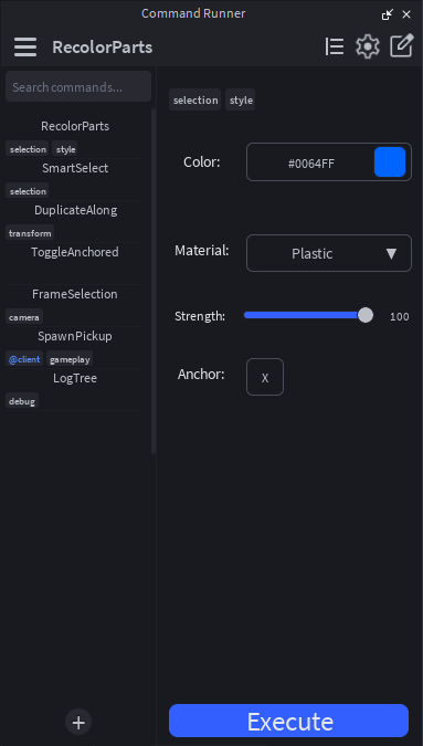
Args panel
The right side of the widget. From top to bottom:
TagsCard
Pinned to the very top of the args panel when the active command has any effective tags. Shows the chips inline, wrapped if there are many. Updates live when you toggle tags via Manage Tags.
Argument cards
One card per entry in Arguments. Each card's appearance depends on its Type. See argument types.
Cards reflow based on the args panel width:
- Short layout (panel width < ~250px): labels stack on top of inputs.
- Long layout (panel width ≥ ~250px): labels sit to the left of inputs.
The threshold is checked on every resize; the cards rebuild on a transition between the two states.
Hidden section toggle
If any cards are hidden, a ▸ Hidden (N) toggle appears at the bottom of the visible list. Click to expand; the hidden cards appear above the toggle. State persists across widget toggles.
Execute button
Pinned to the very bottom of the args panel. Clicking it runs the command. The button is hidden when the active command has DisableExecuteButton = true.
Popups
Seven modal popups, all parented to MainUI. All of them:
- Use the shared
DarkFilterbackdrop click-catcher (Active = trueso clicks on the dim are absorbed instead of falling through to elements behind). - Tween in/out on open/close.
- Dismiss on Escape, click-outside, or their own Cancel/X button.
- Each popup root has
Active = trueso clicks on the popup body don't fall through to the DarkFilter (which would close it) or to elements at lower ZIndex.
| Popup | Trigger | Purpose |
|---|---|---|
| Rename modal | Add button, Rename context item | Captures a name. Generic, used by both Add Command and Rename Command. |
| Manage Tags | "Manage Tags…" context item | Toggles reserved tags + adds/removes custom tags. |
| Library popup | Library book icon in TopBar | Browse personal library + bundled Globals. Save / Load / Delete. |
| Create Argument | "Create Argument…" context item | Form for adding a new argument to the active command (type + per-type fields). Also reused for "Edit Argument…". |
| Color picker | Click the swatch on a color arg card | HSV picker (sat/val square + hue slider via UIGradient), hex input, preset palette. Live-commits on every change. |
| Settings | Gear icon in TopBar | Per-user preference toggles + Edit/Reset buttons for the default command template. See settings. |
| Context submenu | Hover over Load Arguments / Execute items | Per-preset list. Auto-flips to the left if it would overflow right. |
Notifications
Toasts stack at the bottom-right of the widget. Open by props:SendNotification(...) from inside a command. See notifications for the full param shape.
Tooltips
Hover over a sidebar command, an arg card, or any element bound via _bindHoverTooltip for ~400ms. The tooltip appears next to the element with the relevant description text. Tooltips are plain text, max ~280px wide, auto-flip if they'd overflow the widget edge.